Friday, December 11, 2009

Best Typography by me


I have done a lot of typography this semester. Some of my projects were ok, ans some were more on the better side. I think this project of a museum logo was one of my best. I love how the "ball" of text is being handed to the horse. This was done to show the great human to horse relationship and how important horses are in many peoples lives. I think that it also represnts the Inernational Museum of the horse well because almost all of a horses history has been involved with humans.

Typography found in Sharadin


This post is late beacause my camera decided to have issues. But anyway, typography is all of the art building. Every CD major has to take typography classes. I found tgis example of good typography right outside the CD lab ona poster in Sharadin on Wensday around 1 pm. I love this poster. The poster was a povery poster. I love how it uses "I in every 6 people cant read the word povery" and then shows the word which is still legiable, but hard to read. I like how the accual look of the type is part of the poster. Without this element, I think that the message would be not as strong.

Thursday, December 3, 2009

Typography on a food wrapper

Typography is all over advertising to catch the potential buyers interest. This coffee cup holder I found at my work, Sheetz in Whitehall on November 24th around 8am. I really enjoy the design of the type being extended to the end of the holder. The lines create a neat abstract design with the christmas colors. I also like that the type alternates color. If I were to do this myself I would have maybe tried to find a typeface that looks and feel more christmas like.

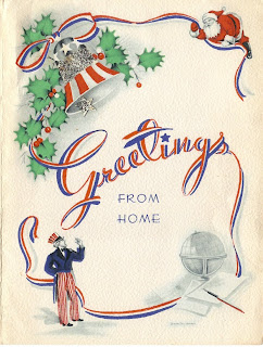
Type as art

All typography is art. This example is from a christmas card I found in a pile of stuff on my desk in Laurys Station, December 3rd, around 12pm. I love how the type is made out of a red wite and blue ribbon. I like how it gives the type a 3-D feel. The continuation of the "G" and the "s" really move your eye around the design and adds interest. I also love the color pallet used.


Wednesday, November 18, 2009

Rebus incorporated in text

This example of a rebus was found on a t-shirt in my house in Laurys Station, around 10pm on Wensday, November 18th. This rebus and text sybolizes "Love forever." The heart represents love, and the word forever is under the image. A rebus adds interest to type and gets the viewers brain moving. I also think it adds to the design and makes the message more memorable. In the future, I will try to incorporate a rebus in to some designs because I like the design of them.

Wednesday, November 11, 2009

Inspirational

I found this inspirational type on a shopping bag that I found in my house in Laury's Station on November 11th around 7pm. I love this logo because the "w" extends to become an arrow. And since the company is called Straight Arrow, I really like the extension to create the arrow. It makes to logo more interesting and calls more attention to it. This inspired to think a little more like this. "Outside the box" may be the right terminology.

Wednesday, November 4, 2009

When good type goes bad

Bad use of typography will always be around. It is just as bad when a typeface is simple miss used or misplaced. I found this example of bad type in my kitchen in Laurys Station, on November 4th, around 9pm. To begin with, this typeface and color combination makes the text extremely hard to read. The text is meant for identification, but instead the viewer must struggle to even read it. The typeface used is very chunky and curvy. Maybe if this were a 70's movie poster it would work, but for foil, not really. This typeface is really misplaced and I think that a cleaner more simplified typeface like Helvetica would suit this foil box better. Sometimes I really wonder, "What were they thinking!?!"

Monday, November 2, 2009

Use of a Ligature

Ligature is a lot of places, but it is not so easy to find because it is often overlooked. This example of a ligature was found when I was trying to fix my camera. It was found at about 8am on Thursday, October 29th, in my camera. It is the memory card for the camera. This is the logo for the ScanDisk company. The use of a ligature is between the "n" ans the "D." They are combined to create one object for two letters. I think this ligature works very well. It is probably overlooked many times, and not notice that the two letters are combined. The ligature creates a neat typographic design.

Thursday, October 22, 2009

Poor Kerning

Poor kerning is everywhere. I never knew what kerning was until I learned it in my Typography class. Now I see poor kerning everywhere. It is like a pest that won't go away. I found a shameful example on the Kutztown University website on Thursday, October 21st around 9am in the CD lab. The link to the example is:
On this web page is a bold black heading that says: "Student Rec Center." This is horribly kerned. When you put up a website for students, prospective students, parents, and faculty to see, wouldn't you take the time to kern? Upon first glance of this header, you can clearly see that the "t" and "u" in "Student" are too close. The letters look anti-social with the "S" and the "d." Com'on Kutztown! Make us proud!

Thursday, October 15, 2009

Bad Typography

Bad typography is everywhere. I found this example at my home in Laurys Station, Around 8pm on October 15th. This advertisement is a magnet I think I got at a parade a few years ago. The design and typefaces are horrible. The advertisment is so busy and cluttered that the accual company is hard to find. I think that there are way too many typefaces used, and too many different sizes. The main company is not even the largest part. The company in no way stands out to the viewer, and everything just gets lost in the make-shift design. This magnet could be greatly improved by just organizing a bit more and rethinking typefaces and sizes.

Wednesday, October 7, 2009

Good Typography

This example of "good" typography was found around 9pm on Wensday, October 7th, at my home in Laurys Station. This is one of my western hat boxes. I am packing up for a big horse show this weekend, and realized how much I love the typography on the box. This brand of hat is a decent brand. The script and italic feel of the typeface gives the feeling of the elegance and quality of the hat. Also, the spur detail on the descender of the "y" gives a playful and "western" feel. The type face on the bottom of the box "Fits Your Lifestyle" is rendered in a more harsh script. I like this because it shows the roughness and toughness most western riders would love to have. I think this box is a great example of good typography. It is very well thought out and designed, attracting the potential buyer.

Thursday, October 1, 2009

Hand rendered typography

Hand rendered typography is everywhere we look. This example of hand rendered typography was found on October 1st, 2009 around 8pm at my house in Laurys Station. This is a dry erase board that is on my refridgerator that people write messages on from time to time. This person writes in a very neat and clean way. The characters resemble Helvetica Neue to me also, except the rounded vertexes on the lowercase "w." I personally like this hand rendered typography beacause I think it gets its point across and says it with a little personality.

Wednesday, September 23, 2009

Historically Influenced Typography

Typefaces are copied from history frequently. Ifound this example of historically influenced typography on a salt container from my house in Laurys Station around 10:00pm on Wensday, September 23rd. This typeface seems to be a mix of historical influences. It seems to be from the Display time, due to it's bold and decorative style. The typeface also seem to be influenced by the figurative typography time because it is designed to accually look like salt grains. Overall, I do like the design of this advertisement, because it is simple, yet fun and playfull.

Naturally Occuring Letterform


Naturally occuring letterform is all around. This photo of a household plant was taken around 8pm, September 16th, at my house in Laurys Station. It shows a lowercase "r" typeface form on the slight left of the picture. Ths "r" also looks like it is in italics, which was interesting to me. I took the picture on a slight slant so the italic is not that drastic, but if you look at the house in the background you can see how it is on a slant. The plant leaves slightly lower of the "r" also looks like a lower case "r" on it's side, but this one seems to be a very vertical and skinny typeface.